< Back
Sign-up journey redesign
Redesigned mobile-first sign-up flow to improve clarity, accessibility, and completion rates.
Quick overview
-
Role: Senior UX Architect
-
Company: Which?
-
Impact:
-
44% increase in completion rate.
-
25% uplift in subscriptions.
-
Improved clarity and ease of use for all users.
-
Situation
High-friction sign-up flow with confusing navigation and poor mobile usability, causing high drop-off and low conversion.
Task
-
Improve accessibility and completion rates for sign-up flow.
-
Identify friction points and redesign IA and user journey.
What I did
-
Mapped existing journey using analytics and usability testing.
-
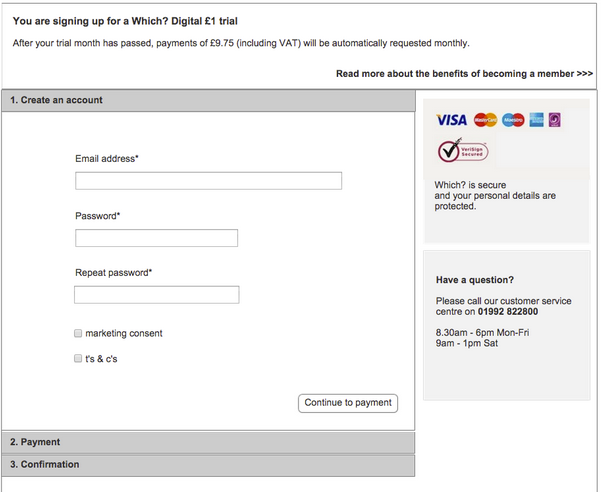
Identified pain points (address look-up, unclear USPs, multiple modal windows, payment friction). Redesigned IA and prototypes for mobile-first experience.
-
Ran iterative usability and accessibility testing.
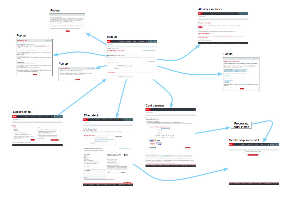
Mapping out the existing journey
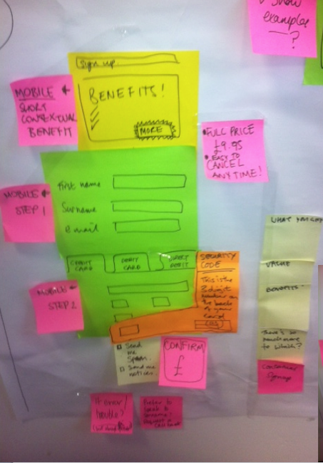
Output of stakeholder workshop
Wireframes of the new sign up journey
Impact
-
44% increase in completion rate.
-
25% uplift in subscriptions.
-
Improved clarity and ease of use for all users.
Who I collaborated with
-
Content designers and developers.
-
Researchers and testers.
-
Stakeholders for subscription products.
-
Product owners.
Reflections
-
Learned that mobile-first design requires testing across device types and contexts.
-
Even small friction points (e.g., address lookup, multiple modal windows) can dramatically affect completion rates.
-
Iterative usability testing with real users is essential to validate assumptions.

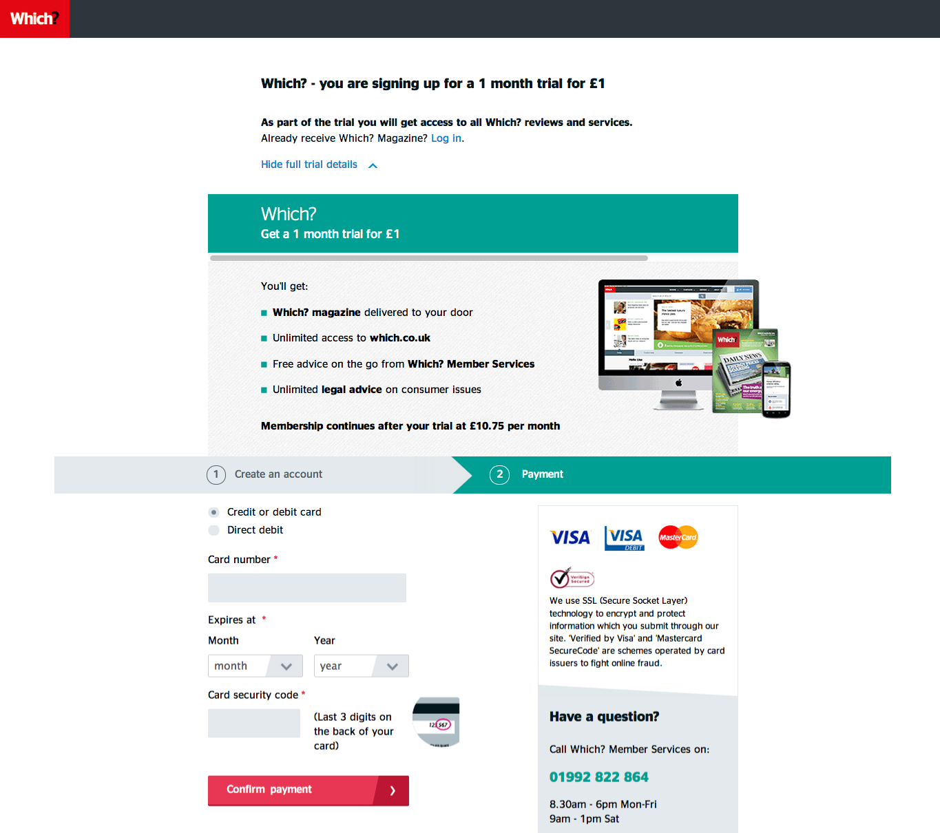
Final designs of the new sign-up page on mobile and desktop.